
A Dictionary of Color Combinations: The 1933 Japanese Color Bible I Keep Coming Back To
Published:
Prices in this post were checked on October 19, 2026 and are a snapshot — they change. HEX values below are digital conversions of the book’s CMYK data (see Sources), so expect small shifts against a printed copy.
The book in one paragraph
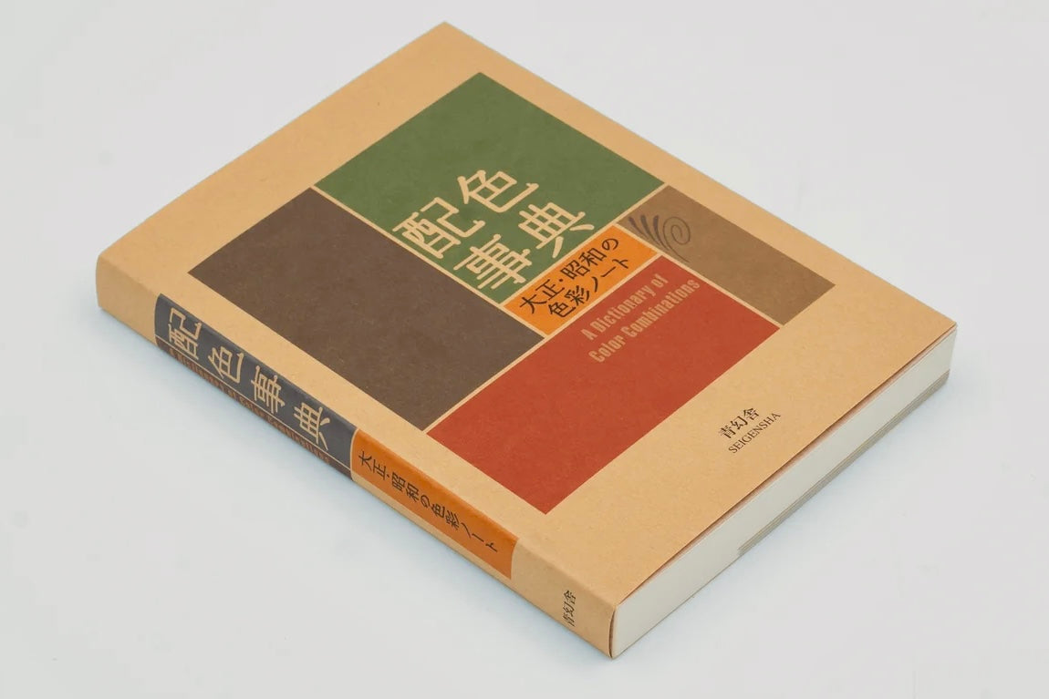
A Dictionary of Color Combinations (配色事典) is a small, fat, pocket-sized book by the Japanese artist Sanzo Wada (1883–1967). It contains 348 color combinations and almost nothing else: no essays, no color wheel, no rules. Each page simply places two, three, or four colors next to each other, as if to say — this works; look. It was compiled from Wada’s six-volume Haishoku Sōkan (配色総鑑), published in 1933–34, and reissued by Seigensha in 2010. Germany’s Die Zeit praised it as a source of inspiration full of “hues we didn’t even know existed.” Designers, art directors, fashion people, and interior stylists around the world keep a copy within arm’s reach. After a friend asked me about it recently, I realized it deserves a permanent page here — both as an introduction for friends, and as a reference I can open whenever I need to pick colors and pick them well.
The man: a painter who treated color as infrastructure
Wada Sanzo was not a guru with a system to sell. He was a working painter and designer who spent sixty years making color a discipline in Japan.
- Born in Hyōgo in 1883, he studied Western painting under Kuroda Seiki, graduated from the Tokyo School of Fine Arts, and spent 1907–1915 in Europe.
- In 1927 he founded the Japan Standard Color Association — the ancestor of today’s Japan Color Research Institute — because he believed color choices should be studied systematically, not left to taste alone.
- In 1932 he became a professor of design at the Tokyo School of Fine Arts. In 1936 he designed the poster for the 1940 Tokyo Olympics — the Games that were later cancelled.
- In 1951 he completed Japan’s first comprehensive standard color chart, Color Standards.
- In 1953 he handled color and costume design for Daiei’s film Gate of Hell (地獄門). The film won the Palme d’Or at Cannes, and Wada won the Academy Award for Best Costume Design — the colors were the point of the film, and everyone knew it.
- In 1958 the Japanese government named him a Person of Cultural Merit.
So when this man published color combinations in 1933, he was not guessing. He was publishing the working notes of the person who literally set Japan’s color standards.
Where the book came from
Between 1933 and 1934, Wada published the Haishoku Sōkan in six volumes, documenting over a thousand color combinations. The original audience was practical: kimono makers, fashion and textile people, printers — anyone whose living depended on colors that harmonize. Japan in the early Shōwa era was absorbing Western dress, Western printing, and Western advertising all at once, and Wada wanted to record a distinctly Japanese perception of color — subtle, muted, nature-derived — before it dissolved.
The Seigensha edition distills that work into 348 combinations built from 159 colors: 120 two-color, 120 three-color, and 108 four-color palettes. Every color carries a name and a number; the back of the book has a CMYK chart for every color and perforated swatch chips you can tear out and rearrange into combinations of your own. Text is in Japanese and English.
Volume 2: the seasons and the streets
The sequel, A Dictionary of Color Combinations Vol. 2 (Seigensha, 2020), revives two more of Wada’s works from the 1930s:
- 72 seasonal combinations themed on the twelve months of the Japanese year, three to seven colors each — plum-blossom months, rainy months, festival months, each with its own weather of color.
- 165 applied examples drawn from 1910s–1930s fashion, interior, and graphic design — what people actually wore, lived in, and printed in Taishō and early Shōwa Japan.
- Color names in Japanese and English, including traditional Japanese color names such as 長春色 (chōshun-iro, a spring plum pink), 花淺葱 (hana-asagi, a light indigo blue), and 梅鼠 (ume-nezu, a plum-gray). The names are half the pleasure: colors named after plants, minerals, weather, and food remember where they came from.
- 172 removable color chips.
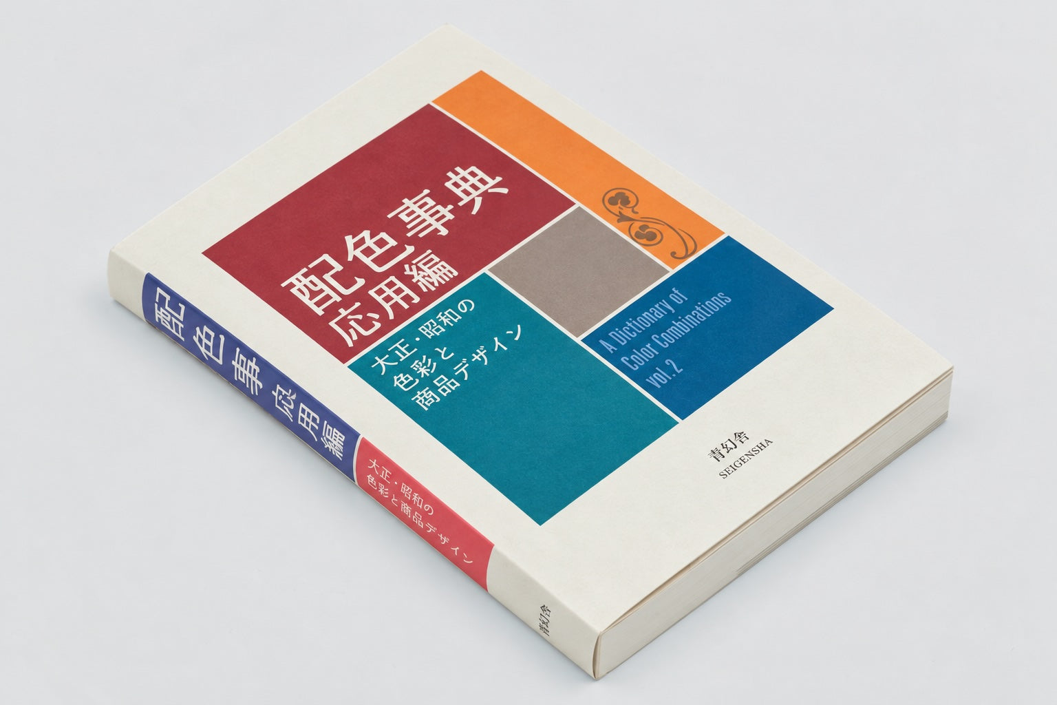
If Vol. 1 is the grammar, Vol. 2 is the literature: combinations in the wild, attached to months, clothes, rooms, and posters.
Why it works (and why most color advice doesn’t)
Most color guidance gives you rules — complementary, analogous, triadic — and leaves you alone with a color wheel to execute them. Wada gives you verdicts instead of rules. A lifetime of looking, compressed into these go together. Three things make his verdicts age so well:
- Harmony over contrast. Most palettes share an undertone, a temperature, a weather. Even the loud ones never shout.
- Muted bases. Wada avoided saturated primaries. His red leans terracotta, his blue leans slate, his yellow leans ochre. Muted colors are forgiving: they survive bad lighting, cheap printing, and changing taste.
- Names from the physical world. A color called “Burnt Sienna” or “Sudan Brown” tells you how to feel about it before you see it. The vocabulary is a design tool in itself.
The honest limitation: the book gives combinations, not proportions. It won’t tell you how much of each color to use. My working rule, stolen from how the palettes look when they’re printed as equal blocks and then applied: let one color dominate, one support, and treat the rest as accents — roughly 60 / 30 / 10 for three colors. Wada supplies the cast; you still have to direct.
The reference: thirteen combinations I actually use
These are my picks from the 348 — the ones I reach for first. Numbers are the book’s own combination numbers. Each color lists its name, HEX for screens, and the book’s CMYK for print. Screen conversions of print colors are approximations; if a job is going to press, trust the book.
Two colors
No. 1 — English Red #D96629 (CMYK 13/73/100/0) · Cerulian Blue #0093A5 (CMYK 84/26/32/0)
The book's opening combination — a saturated orange against a deep teal. Posters, covers, anything that has to be seen from across the room.
No. 2 — Yellow Orange #F99D1B (CMYK 0/45/100/0) · Dark Tyrian Blue #12354E (CMYK 90/66/36/50)
Marigold on deep navy. The highest-contrast pairing in this set; signage, sports, brand marks.
No. 3 — Raw Sienna #BB7125 (CMYK 18/58/100/12) · Pale Lemon Yellow #FFEFAE (CMYK 0/4/38/0)
Two warm yellows, one burnt, one pale. Quiet and edible — food packaging, paper goods, book covers.
No. 27 — Corinthian Pink #F8B6BA (CMYK 0/35/15/0) · Slate Color #34454C (CMYK 85/70/62/30)
Powder pink held down by slate. The calmest two-color pairing here; interiors and product UI.
Three colors
No. 121 — Brown #7C4226 (CMYK 35/74/90/35) · Ochraceous Salmon #D8A37B (CMYK 15/38/55/0) · Lincoln Green #555832 (CMYK 60/48/86/37)
An earth triad: brown, salmon clay, moss green. Autumn clothing, outdoor brands, anything that should smell faintly of soil.
No. 150 — Seashell Pink #FDD4BD (CMYK 0/19/23/0) · Citron Yellow #B2B73E (CMYK 35/17/95/0) · Glaucous Green #B4CDC2 (CMYK 30/9/24/0)
Spring pastels with a citrus bite. Cosmetics, stationery, children's things — sweet but not saccharine.
No. 200 — Carmine Red #A62C37 (CMYK 25/95/80/16) · Olive Buff #C1C494 (CMYK 16/6/42/12) · Chromium Green #719470 (CMYK 50/16/58/20)
Deep carmine red against two olive greens. Retro editorial energy; wine labels, book jackets, jazz posters.
No. 227 — Hermosa Pink #F9C1CE (CMYK 0/30/6/0) · Light Glaucous Blue #A5C8D1 (CMYK 35/10/14/0) · Cerulian Blue #0093A5 (CMYK 84/26/32/0)
A pink-to-teal gradient family. Summer, beauty, and anything that wants to feel like shaved ice.
Four colors
No. 250 — Pyrite Yellow #CAB356 (CMYK 23/25/80/0) · Peach Red #F15A30 (CMYK 0/80/90/0) · Sea Green #00B49B (CMYK 80/0/51/0) · Nile Blue #BCE4E5 (CMYK 25/0/10/0)
The loudest palette in this selection: brass yellow, coral red, sea green, pale cyan. Festivals and sportswear.
No. 273 — Hermosa Pink #F9C1CE (CMYK 0/30/6/0) · Pansy Purple #7D133A (CMYK 34/100/60/34) · Sudan Brown #A36752 (CMYK 25/60/65/19) · Neutral Gray #B6BFC1 (CMYK 29/18/20/0)
Dusk tones — blush, plum, cocoa, gray. The most 'evening' palette here; fashion and fragrance.
No. 300 — Grenadine Pink #F48067 (CMYK 0/62/58/0) · Cream Yellow #FDBF68 (CMYK 0/28/68/0) · Turquoise Green #B5DECC (CMYK 29/0/24/0) · Calamine BLue #78CDD0 (CMYK 50/0/20/0)
Sorbet colors. Ice-cream shops, summer sales, anything that should feel cold and sweet.
No. 342 — Corinthian Pink #F8B6BA (CMYK 0/35/15/0) · Cream Yellow #FDBF68 (CMYK 0/28/68/0) · Orange Citrine #986F2D (CMYK 28/48/92/24) · Deep Slate Olive #253122 (CMYK 76/60/80/62)
Warm daylight fading into deep olive shade. Cafés, homeware, slow-living brands.
No. 348 — Olive Buff #C1C494 (CMYK 16/6/42/12) · Cossack Green #437742 (CMYK 76/32/91/18) · Deep Slate Olive #253122 (CMYK 76/60/80/62) · Cotinga Purple #501345 (CMYK 66/100/42/40)
The book's final combination: olive and forest greens with a single purple shadow. Night woods; book covers for serious novels.
Postscript: this website
This site’s current design — ink black, paper white, one restrained gold — was chosen in October 2026 after I went back to this book and its way of thinking: few colors, clear jobs, no decoration doing the work that color should do.
My site — Ink #0B0B0D · Paper #EDEAE2 · Gold #C2A15A · Steel blue (tags only) #8BA0C4
Three colors with strict jobs: background, text, one accent. The fourth is rationed to tags. Not from the book — but chosen by its rules.
How to get it, and how to browse it free
- Vol. 1 — Seigensha, 2010. ISBN 978-4-86152-247-5. Vol. 2 — Seigensha, 2020. ISBN 978-4-86152-772-2.
- Both are widely stocked by art bookstores and online retailers. When I checked on October 19, 2026, Galen Leather listed both volumes at $28 each — prices vary by retailer and over time, so treat that as a snapshot, not a quote.
- Free to browse: an interactive version of all 348 combinations lives at sanzo-wada.dmbk.io, and Wada Sanzo Colors offers HEX/RGB/LAB values, a color picker that finds the closest Wada color to any color you give it, and iOS/Android apps. The physical book is still the better object — the printed swatches are the real colors, and the tear-out chips are genuinely useful — but the sites are perfect for a quick decision at your desk.
If you buy one design book this year and you make anything visual — slides, sites, rooms, outfits, gifts — make it this one. It is ninety years old, fits in a coat pocket, and has never once given me a palette that embarrassed me later.
Sources: Sanzo Wada — Wikipedia · AbeBooks — Vol. 2 publisher synopsis · Galen Leather — Vol. 2 (ISBN, chips, seasonal structure; price checked Oct 19, 2026) · WAFUU — Vol. 2 description · Kojo Art — what the book contains · Palette data: dictionary-of-colour-combinations dataset (Matt DesLauriers / Dain Blodorn Kim) — CMYK from the book, HEX converted from CMYK.
Share on
Twitter Facebook LinkedIn☕ Buy me a coffee! 💝
If you found this article helpful, consider buying me a coffee to support my work! 🚀